John Hatley

UX Designer

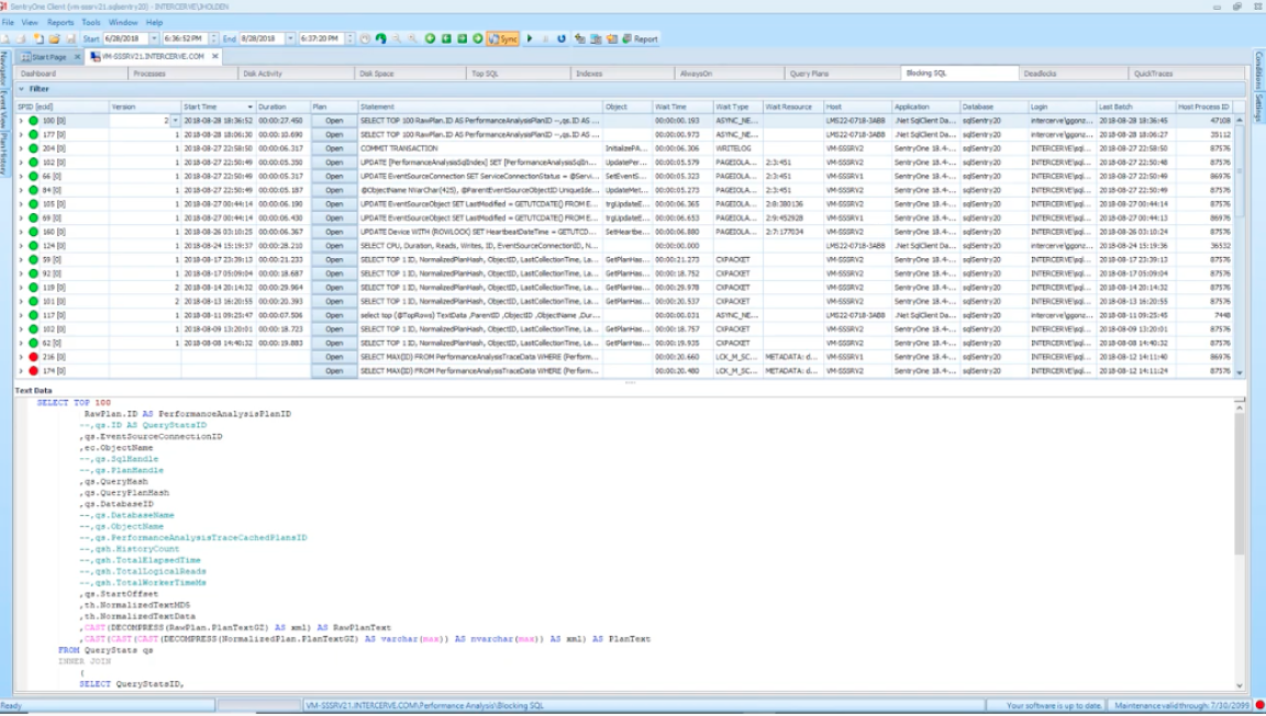
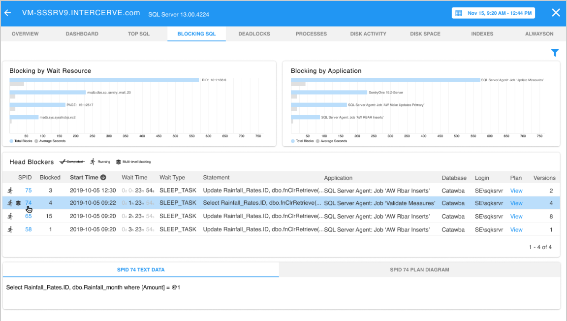
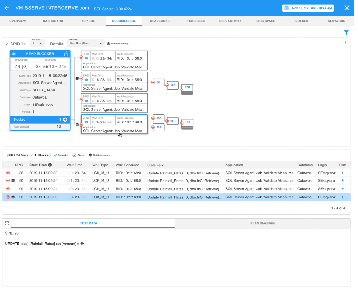
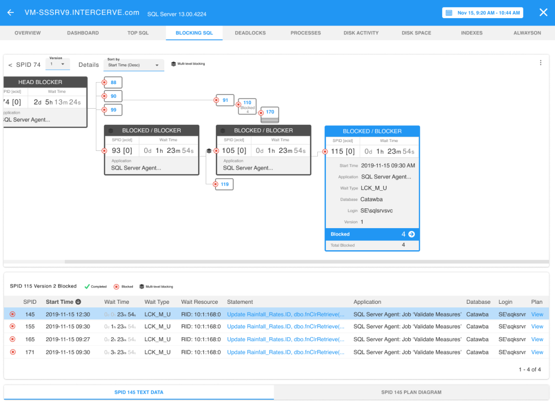
Database Blocking Diagnosis Application

Migrating a windows-based application to the cloud and improving usability.

Basics

Year:

2019/2020

Tools Used:

Figma, Axure

Role:

UX/UI Design

About

Business Goal:

Provide new and existing clients proven diagnosis capabilities via a cloud-based application.

Tasks:

Replicate existing feature set into a cloud-based application, improve usability and reduce the learning curve.

My Role:

My role was to lead the user research, perform holistic review of the existing application, deliver the UX and UI patterns, build a clickable prototype and perform end user testing and validation.

User Research

Interviews and Observations:

2 Groups of 5 - Existing Users/Free Agents

Existing Users:

Experience with the Windows application ranged from 1 to 12 years.

Free Agents:

DBA's, Developers and Generalists with 1-8 years of DB experience.

Findings & Collateral

Most Important Data:

Users overwhelmingly agreed on several data points being critical to diagnosis:

  • blocked resource
  • impacted application
  • duration and/or wait time
  • size of the block chain

Additional Legacy Application Issues:

During observations the existing users also complained about:

  • number of clicks required to get to some information
  • lack of summary data
  • unclear/inconsistent controls
  • a sense of data overload

These issues were common within most areas of the legacy application, as the application delivers mass amounts of grid-based data directly to the user by default.

Prior to design:

In addition to the user input, I leaned on a few other information sources to help provide a complete picture prior to designing:

  • existing training materials, product backlog of bugs/enhancements, competitor's offerings
  • engineering and architecture team members to best identify limitations and performance considerations
  • product management was consulted for business priorities

Solution

As mentioned by the users, the legacy application inundates users with detailed data from the start of their journey in identifying blocking issues. The grid provided 16 columns of data and an unlimited number of rows for the users to filter through. The grid is also hierarchial in nature, so the depth of the block required users to click through each parent level, there can be (n) levels in a chain. These observations map directly back to the findings of "data overload", "number of clicks", and "lack of summary information". In addition, there actually IS summary data available to users, however the navigation to the data is a cumbersome process of selecting the "Report" button and moving through a series of options in order to coordinate the specific report with the database server the user is currently reviewing blocks on. Again, "too many clicks".
Legacy Application
Legacy Application

Once I had completed my research, I was able to determine several opportunities for improvement as well as what proven elements to bring forward for the initial "Blocking" landing page.
  • existing reports had great summary information, let's reformat the graphs and provide those as an intial tool for diagnosis
  • condense the data set on the grid to the "most important" elements as id'd by the users
  • provide clear iconography and a legend to describe the data
  • include a count of the blocked resources to indicate the size of the issue more clearly
The initial landing page for blocking (see below) provides the user with a more consumable set of data. The graphs provide some important summary-level information about specific resources being blocked as well as the actual applications that are being impacted by the block. DBA's are able to quickly determine what applications are a priority and where they should begin to focus their attention. In addition, the grid provides more detail with fewer columns than the original. Again, putting the focus on the elements deemed to be most critical in determining where to spend their time.


Upon the selection of a row (SPID) the user is presented with an interactive card-based UI that:
  • Clearly illustrates the depth and complexity of the block chain
  • Focuses the user on the details of a single node but still provides sufficient detail of parent and child nodes to allow them to easily make a decision.
  • Provides sharing capabilities at each node level, allowing the user to determine how much info they want to provide outside teams.
  • Remains in sync with the blocked grid providing a familiar set of controls to seasoned users. Cards, rows and all sorting and filtering controls are married between the card presentation and the corresponding grid presentation.


As the user moves through the cards, the focused card is highlighted and additional details are presented about it as well as the directly connected nodes both upstream and downstream. This relationship and subtle treatment allows the user to easily see the relationships between each node without overpowering them with details they have not asked for.

Conclusion

After the initial conceptual review with product management and stakeholders I created a clickable prototype with Axure in order to conduct user testing. As part of the stakeholder review I agreed to conduct A/B testing with a more traditional (read copy/paste) version of the interface that leveraged a hiearchical grid. I created that prototype as well and tested both with the following conclusions:
  • 10 users were identified for testing (5 existing customers trained and familiar with the legacy application and 5 non-customer DBA's).
  • 20 tasks were identified and scripted into the prototypes, matching details in each version.
  • 5 users tested with A first, then B and 5 were reversed so as not to bias their results.
  • Users were able to complete 100% of the tasks in each A/B
  • The card-based version allowed users to identify key elements 50% faster resulting in a task efficiency difference of about 25% in favor of the card-based version. Legacy users were less efficient than new users, but were still more efficient overall.
  • 8/10 users preferred the card-based version over the legacy grid version.
  • 10/10 users found the collaboration tools presented in the card version extremely helpful in communicating issues to outside teams.
  • New use cases were identified as a result of the testing, Post-Mortem reporting was much easier via the card-based version.

Contact

Have a nice project coming up? Let’s talk about it! Shoot an email to john.hatley@gmail.com